DiabetesAide A UX Journey
I am not a diabetic, but I spend a lot of my time considering their needs.
I think about how much insulin my partner, a Type 1 Diabetic, will have to take when I’m making dinner and I spend extra time adjusting recipes and calculating nutritional data for every pie I bake at Thanksgiving so my sister-in-law’s father can enjoy dessert. So this past spring when my father received a Type 2 diagnosis, and I watched as he re-calibrated his life, I couldn’t help but wonder if there was a better way to help others in his shoes.
Issues around health care have always intrigued me, and here was a very clear problem: how could we better alleviate negative emotions that may arise after a diabetes diagnosis? While applying all aspects of the UX design process, I wanted to find a solution that could better work in the age of apps. My end result, Diabetes Aide, is an app specifically targeted to assist newly diagnosed diabetics navigate their changing relationship with food.
Overview
Role(s):
UX Researcher & Designer
Timeline:
4 months (March – June 2019)
Client:
Springboard Course
Project Type:
Mobile App
What are they feeling?
Survey
As I observed my father I had a growing assumption of the main issues that plagued new diabetics, but I needed more data to verify. I shared a screener survey via social media in hopes to identify potential interview candidates.
Sample Questions
- Which best describes you? (type of diabetic)
- How long have you been a diabetic?
- How did you primarily educate yourself about diabetes?
- Briefly describe the circumstances around diagnosis. For example we're you pre-diabetic? Did your diagnosis come suddenly? Were details of your diagnosis different in some way?
- What were your main obstacles post diagnosis? For example, did you struggle with changing your diet? Did you feel you lacked emotional support?
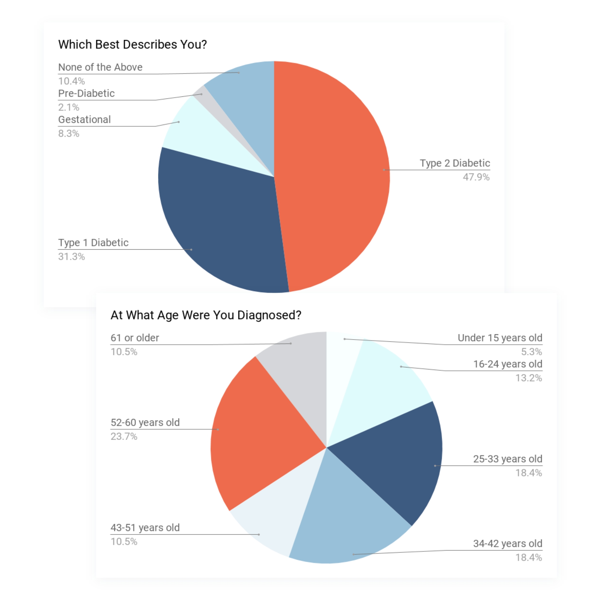
Finding the right match
Since health is such a personal issue I divided the survey into separate sections, with the questions getting gradually more personal. I allowed respondents to exit at various sections throughout the survey to ensure that I received at least some data if a user felt uncomfortable progressing, but also allowing me to identify candidates who were truly comfortable speaking about themselves.
In total I fielded 48 responses, and was able to identify four interview candidates that met the below criteria:
- Type 1 or Type 2 Diabetic
- Diagnosis after age 16
- Diagnosis unexpected (not pre-diabetic)
- Preference for digital educational resources
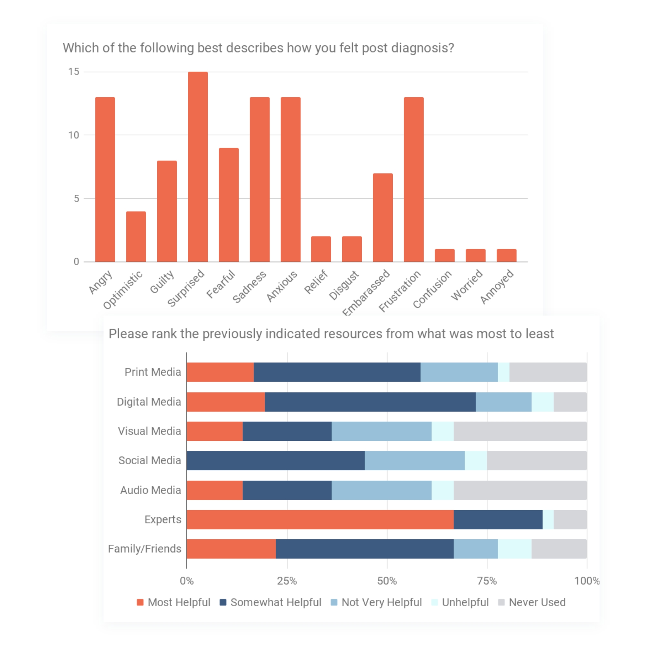
Interviews
I wanted to better understand the mindset and needs of the newly diagnosed.
Unfortunately, none of my interview subjects were new to being diabetic. However, I hoped that memory and feeling would paint a vivid image of my subject’s experiences. I divided our interviews into sections, but this time I focused on three specific things or events:
- Life Post-Diagnosis
-
- Think back to the time when you first learned you were diabetic; what do you remeber from that time?
- In what ways did your diagnosis impact your life?
- Looking Back
-
- What do you think you could have done better?
- In the initial survey, you indicated feeling (feeling(s) indicated from individual's survey) after finding out you were diabetic
- Diabetes Education
-
- What type of information were you looking for right after your diagnosis?
- What makes digital/online media resources for diabetics difficult to use?
Key Insights
- All interview subjects were able to identify in detail when they found out they were diabetic, and for some it caused them to get quite emotional.
- After receiving their diagnosis they all identified as feeling some loss of control within their lives.
- Subjects indicated that digital resources aimed towards diabetics were either too broad or not comprehensive enough to help, but they are the most convenient method.
- Professional resources, like Diabetes Educators or Nutritionists/Dietitians, were greatly beneficial in the learning curve for all the subjects, but they weren't the most convenient either due to shame felt when encountering the professionals or the resources it took to obtain an appointment.
- Though not acknowledged by the subjects, they all detailed shifts in personal relationships due to either trying to keep ‘normalcy’ with or hyper-managing of their diet.
Overall, my interviews provided valuable insights into the mental state and needs of diabetics. I left with a clearer understanding of my potential users.
Affinity & Empathy Maps lead to in-depth Personas
If I wanted to find a solution I needed to see who my users were.
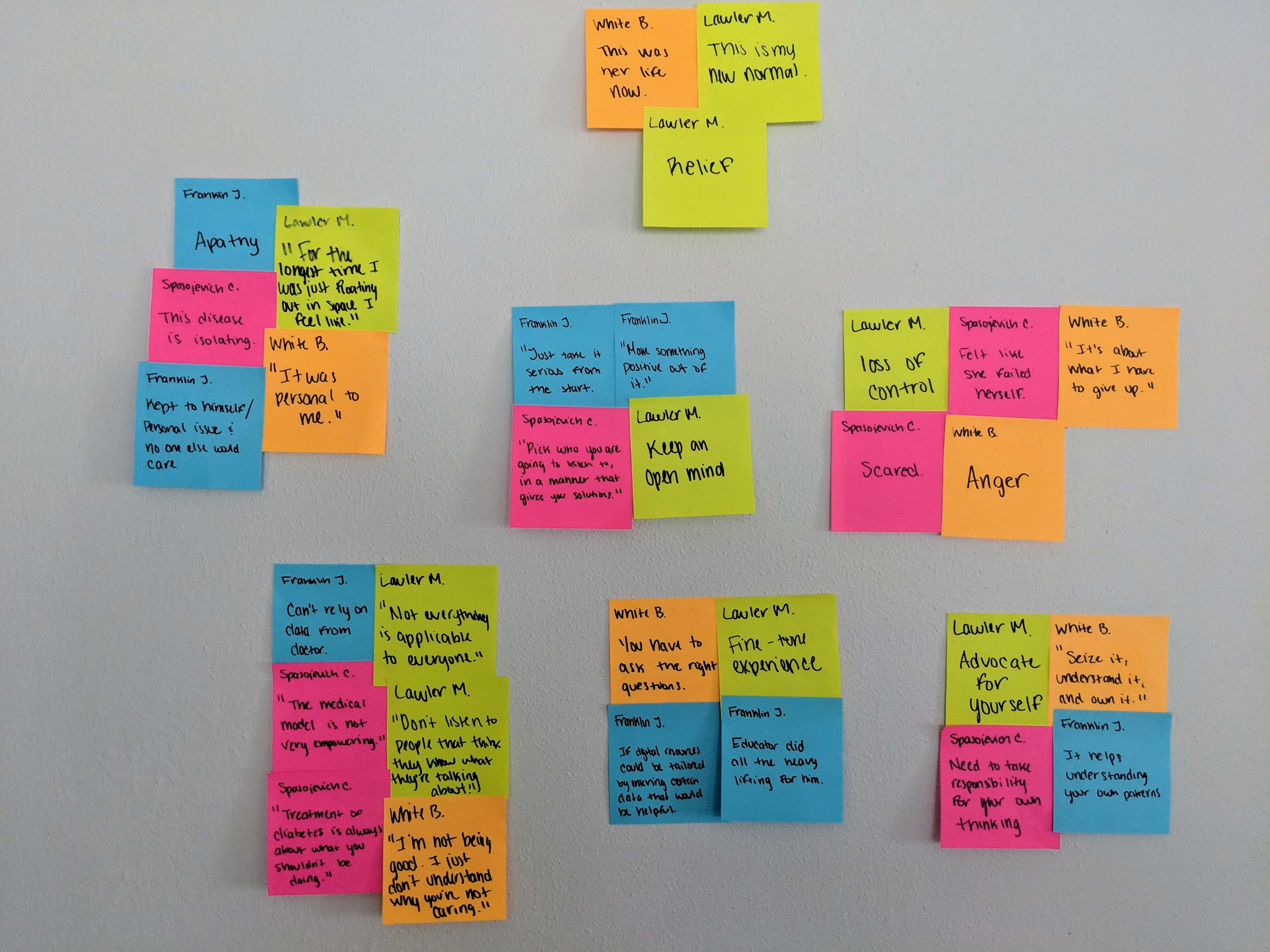
After my interviews I took time to absorb what my subjects told me by re-playing our discussions. I needed to highlight the common threads between them. To begin I created an affinity map filled with key quotes and other important ideas that were brought to light to help me focus on the most crucial data.
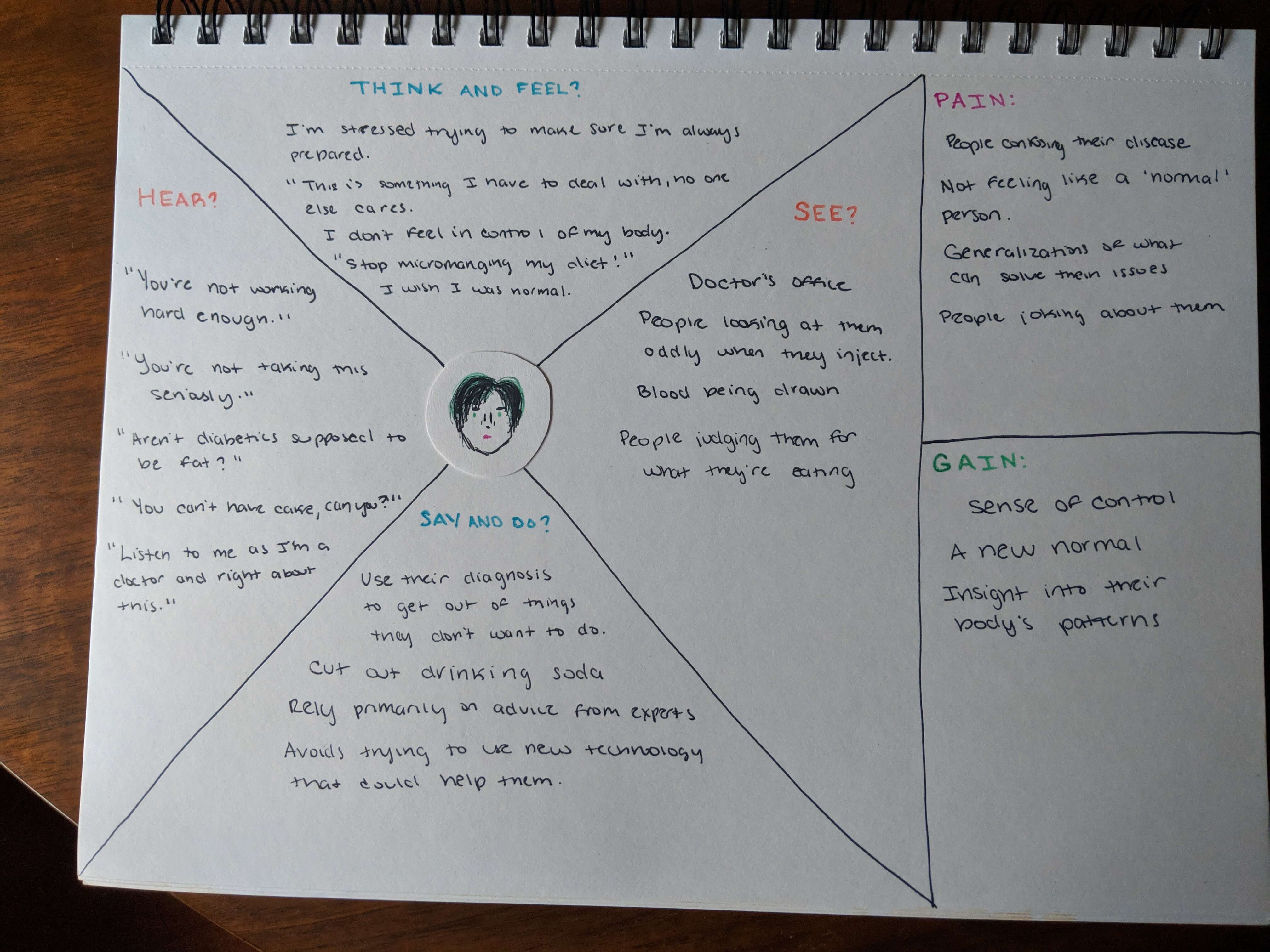
Once I had established the most inspiring observations I developed a set of empathy maps. I wanted to flesh out who my potential users were and thinking deeply about their pain points, goals, behaviors, thoughts, and feelings helped create more convincing back stories.
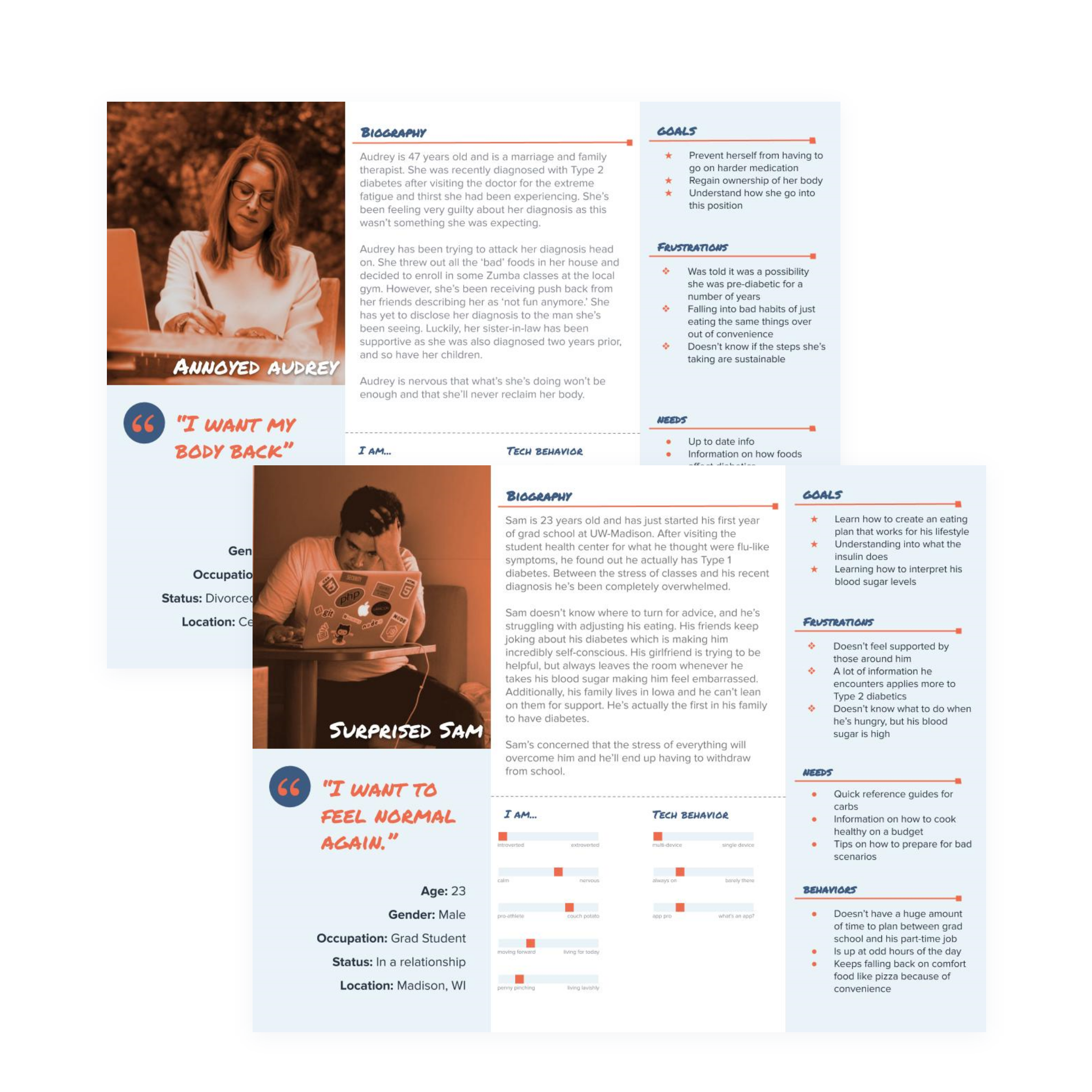
In the end I established two personas, Sam and Audrey, who I believed represented the most common users of my application.
Surprised Sam is young and just figuring out who he wants to be. His Type 1 diagnosis throws his life out of balance as he struggles to figure out how to readjust with little support around him.
Annoyed Audrey is middle-aged and completely thrown off by her Type 2 diagnosis. She over compensates by doing the max, but worries greatly about being able to sustain her own success.
So, what does it do?
A User's Journey
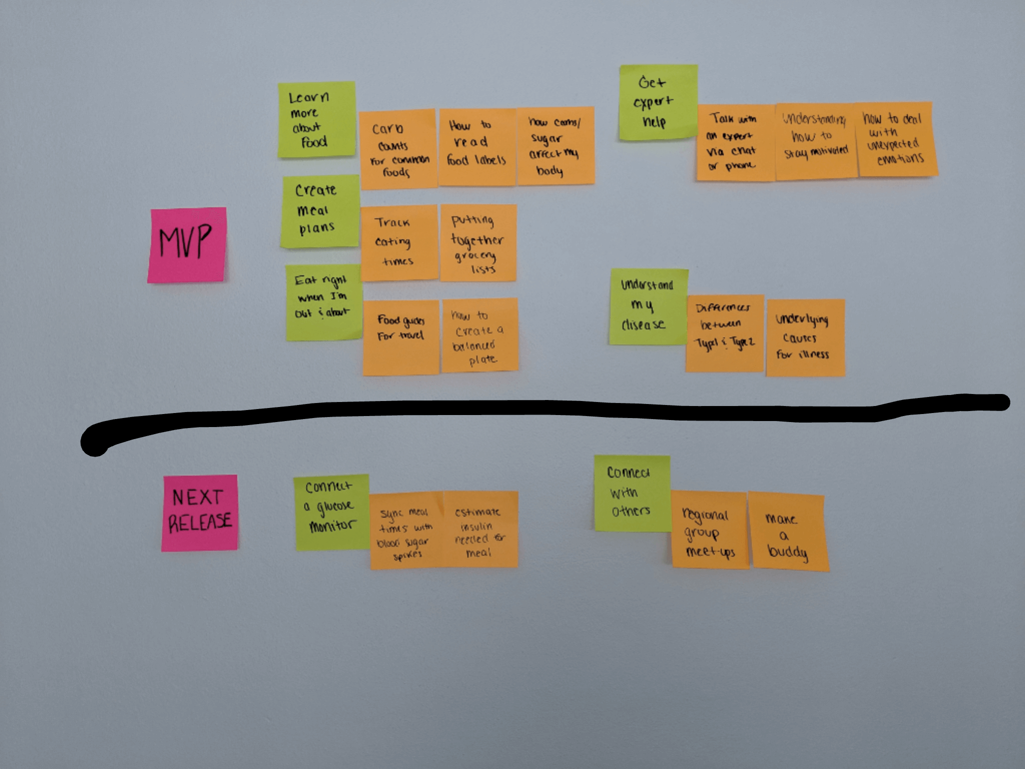
With Sam and Audrey in mind I began to compile a feature list. I identified nearly 50 user stories, focusing on the following epics, which covered the most immediate needs for my users.
- I want to learn more about food so that I can get in control of my health.
- I want to learn how/what to eat when I'm out or traveling so that I can still feel normal around others.
- I want to maintain a healthy diet so that I can keep my condition under control.
- I want expert input so that I can ease doubts.
Sitemap
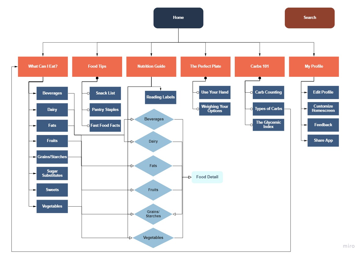
There were so many potential features and I wanted to use them all. At first I thought narrowing my focus to the first three epics would be okay. However, I realized after some discussion that my initial sitemap provided more content than I could feasibly pull together for an MVP. I then settled on just the first epic which represented the most basic need present among all my interview subjects and personas, re-evaluating their relationship with food.
User Flows
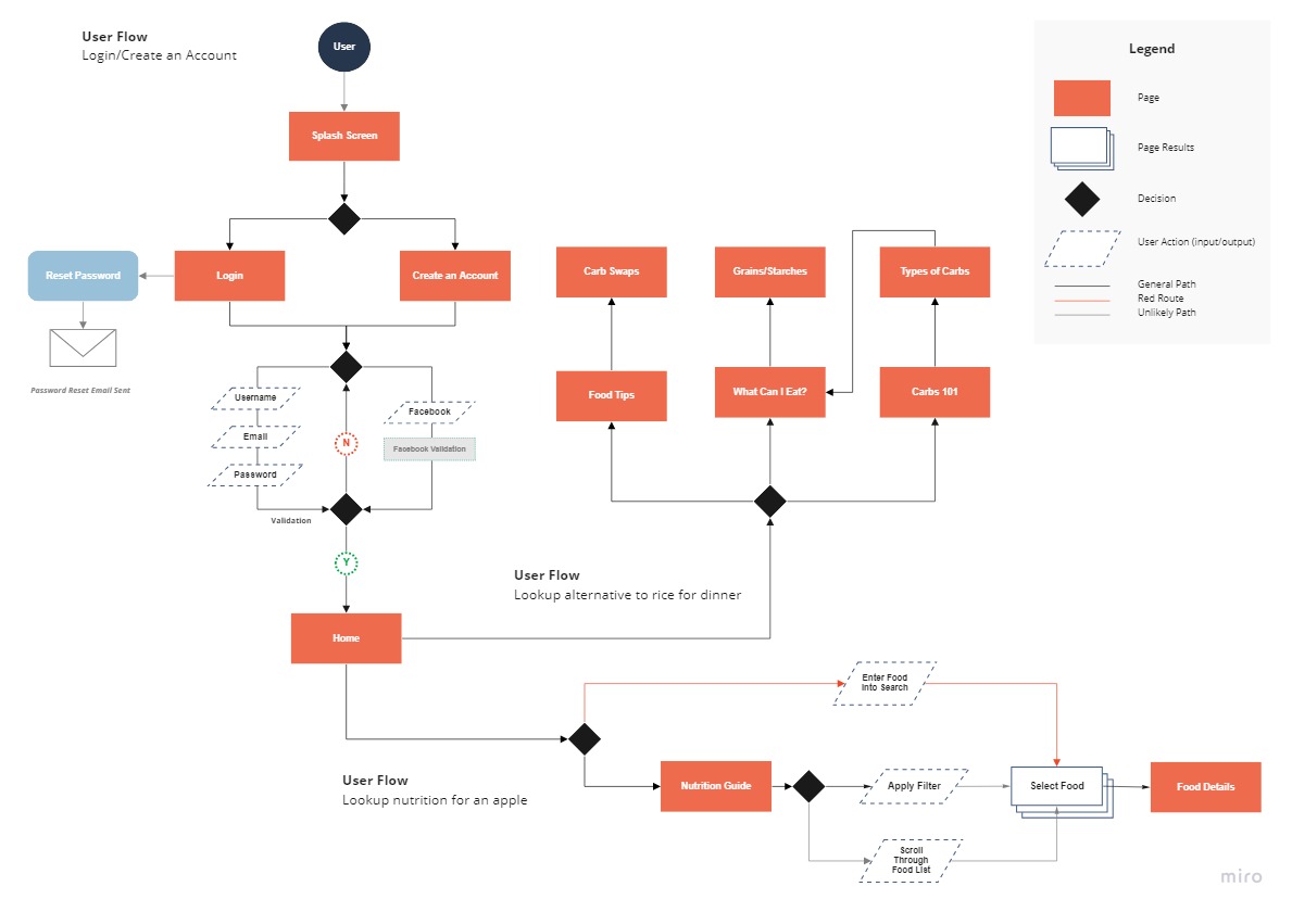
After establishing what my app would do I created three sample user flows that I used to guide my wireframe process:
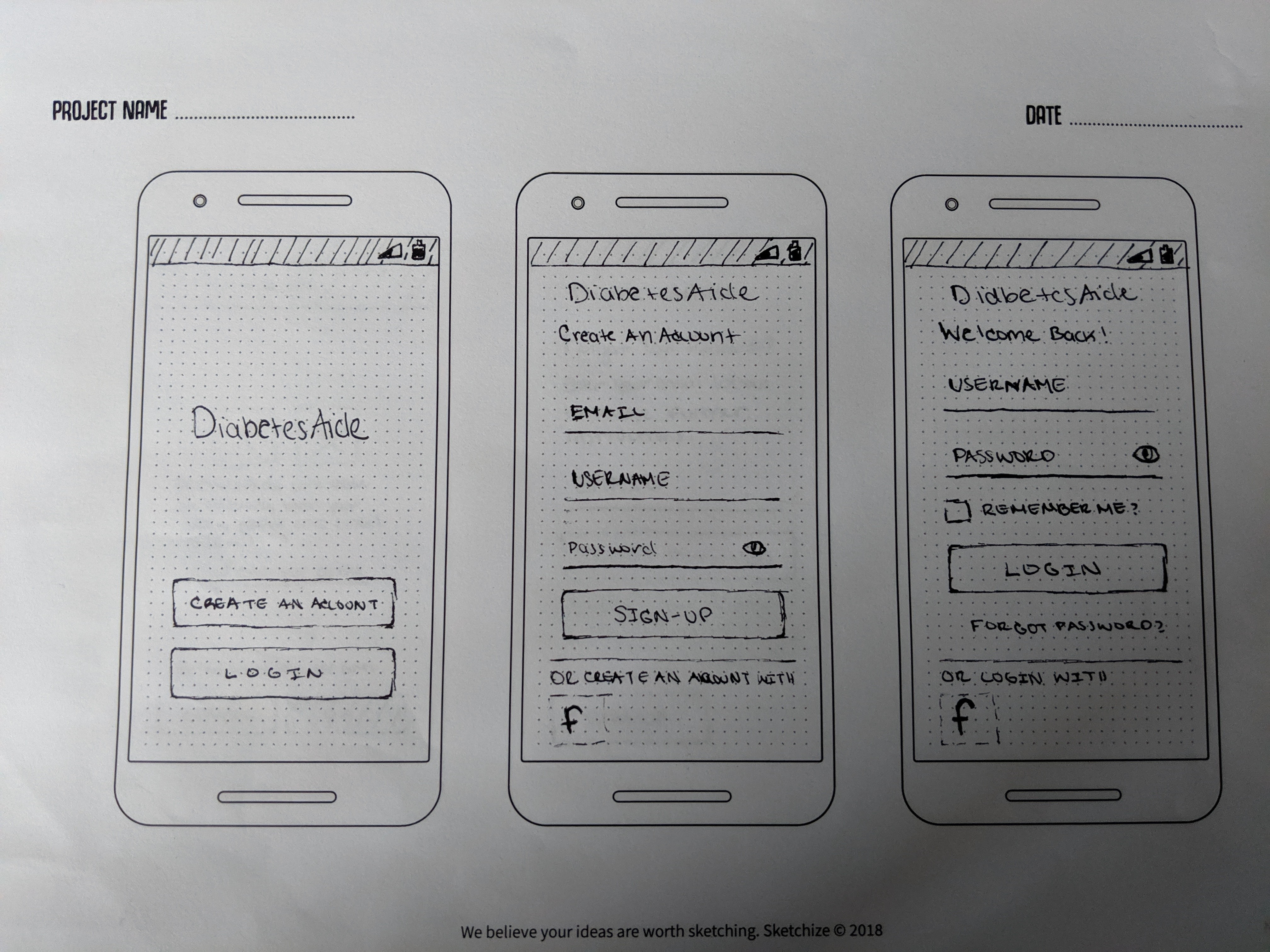
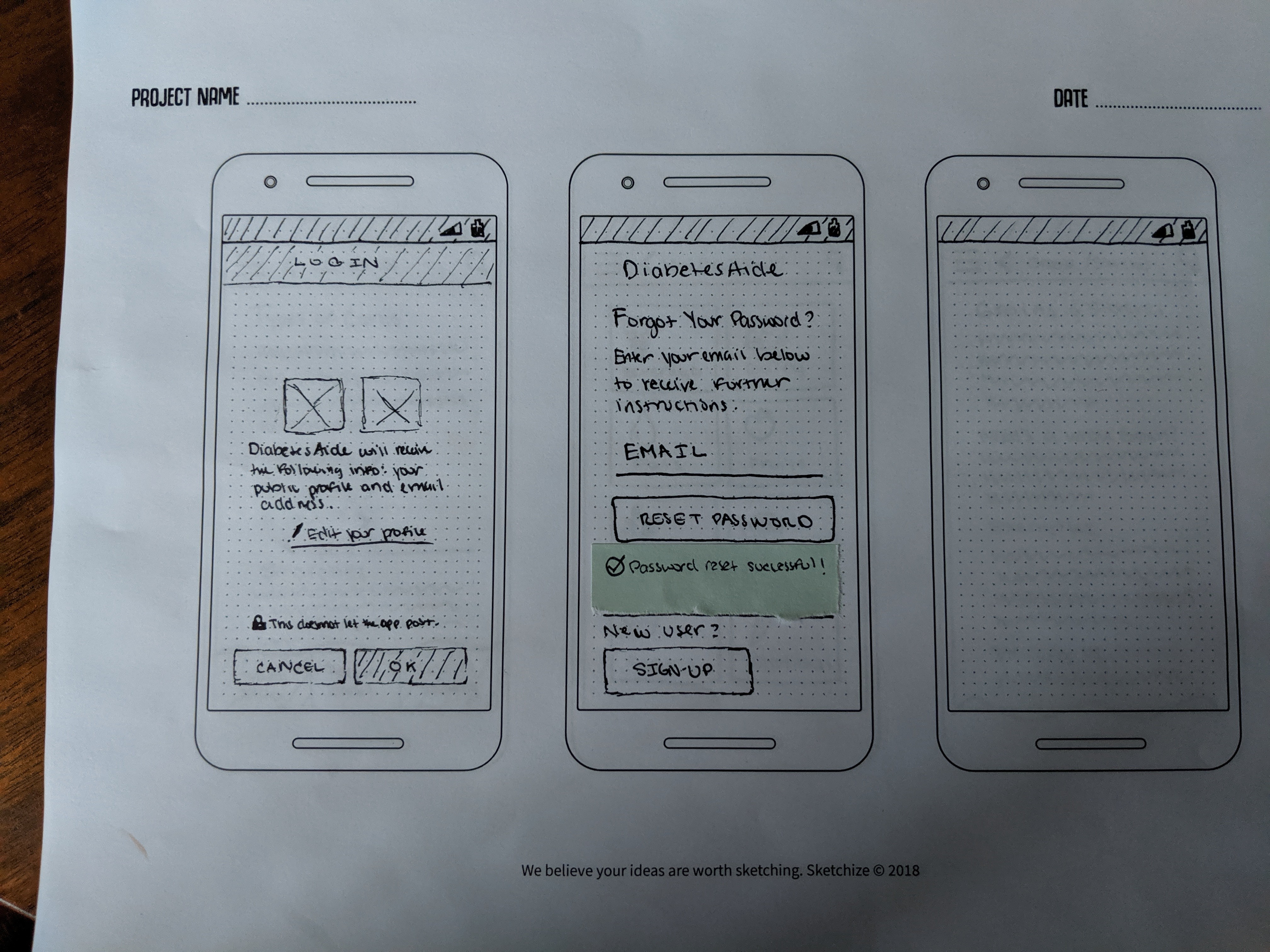
- Account Creation/Login
- Identifying Food Nutritional Data
- Finding an alternative for a 'carb-heavy' food item
My flows were pretty basic which worried me at first, but after some introspection I realized that I was over-thinking it. In my mind I thought it had to be complicated for it to be successful, but complex systems don't always yield the best experiences.
What does that look like?
Paper Sketches and Guerrilla Testing
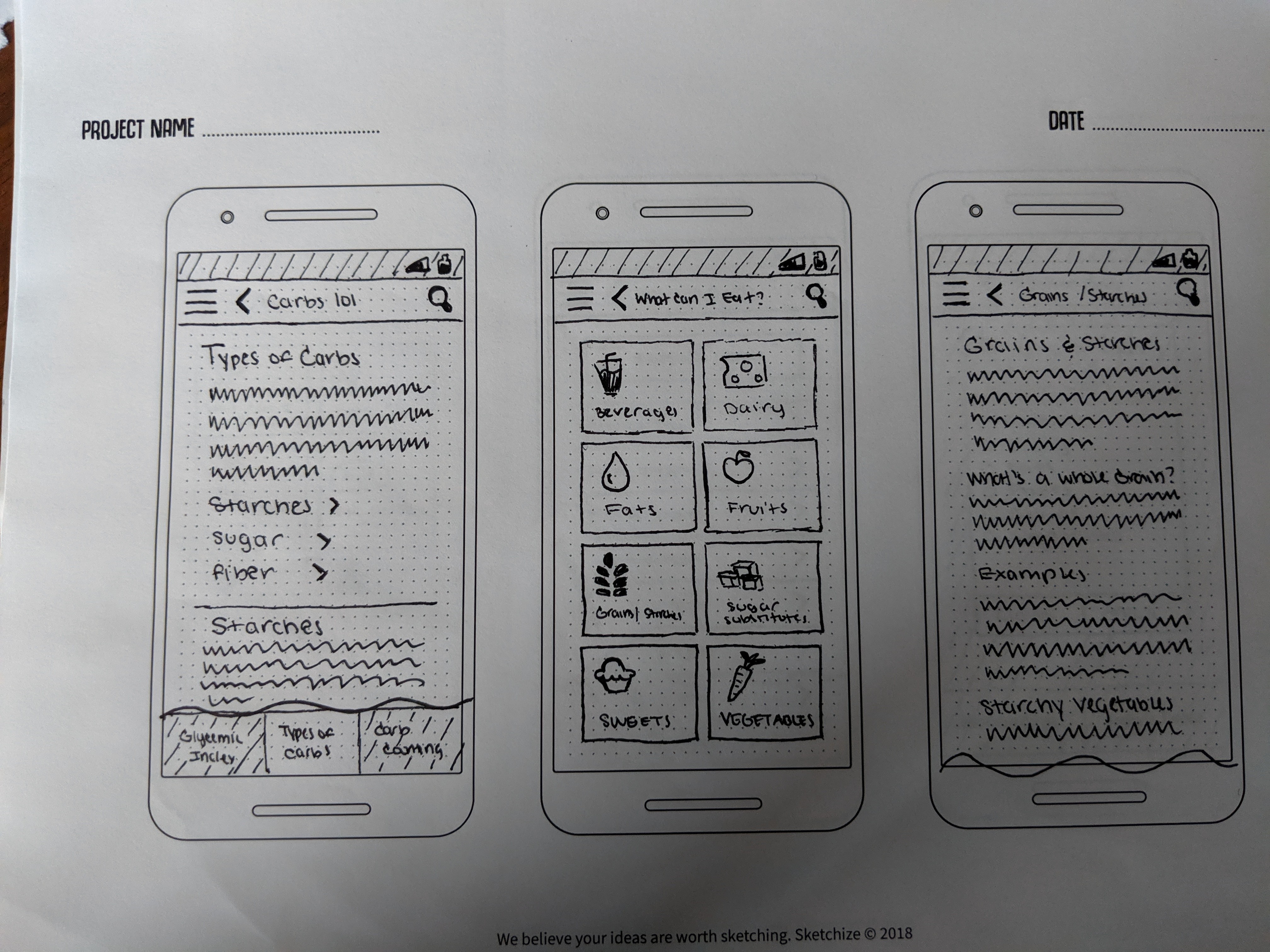
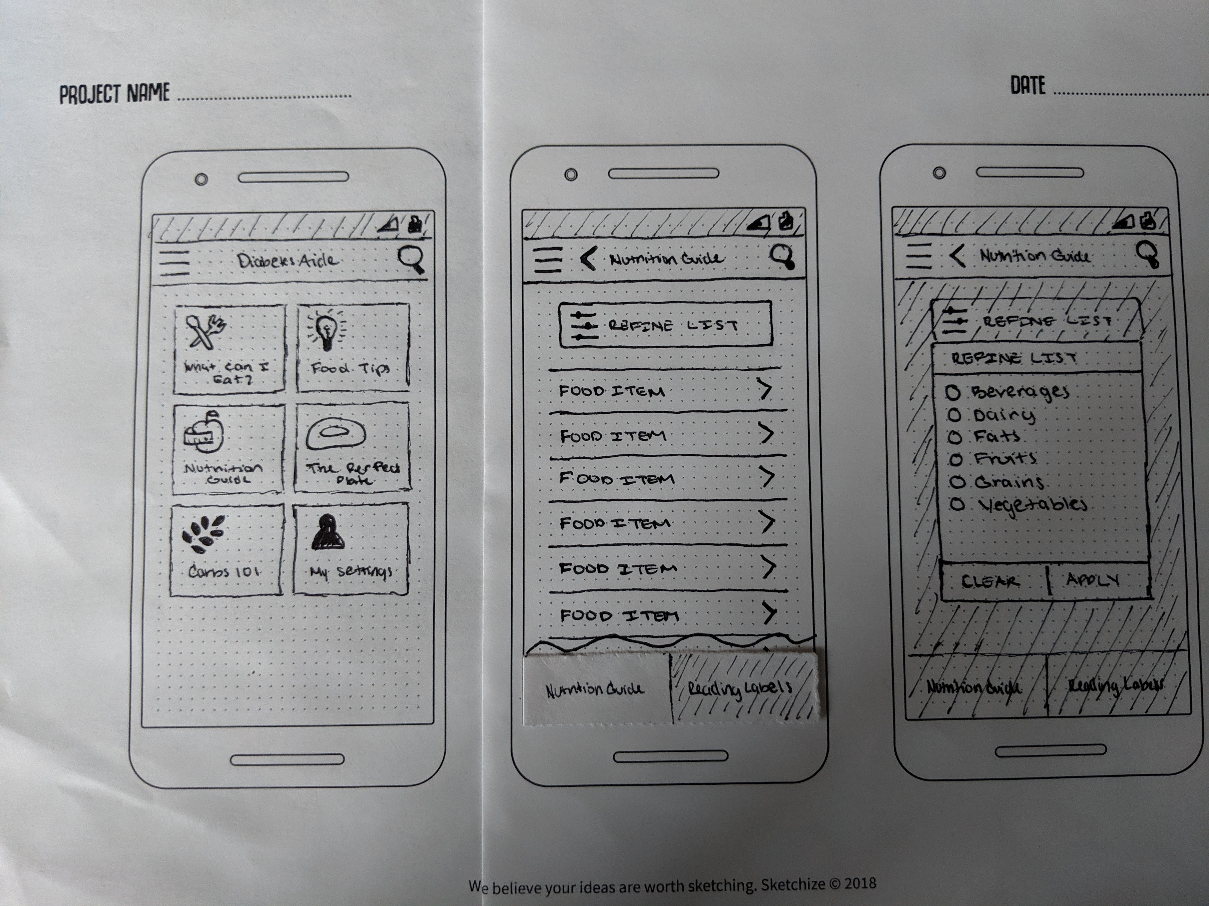
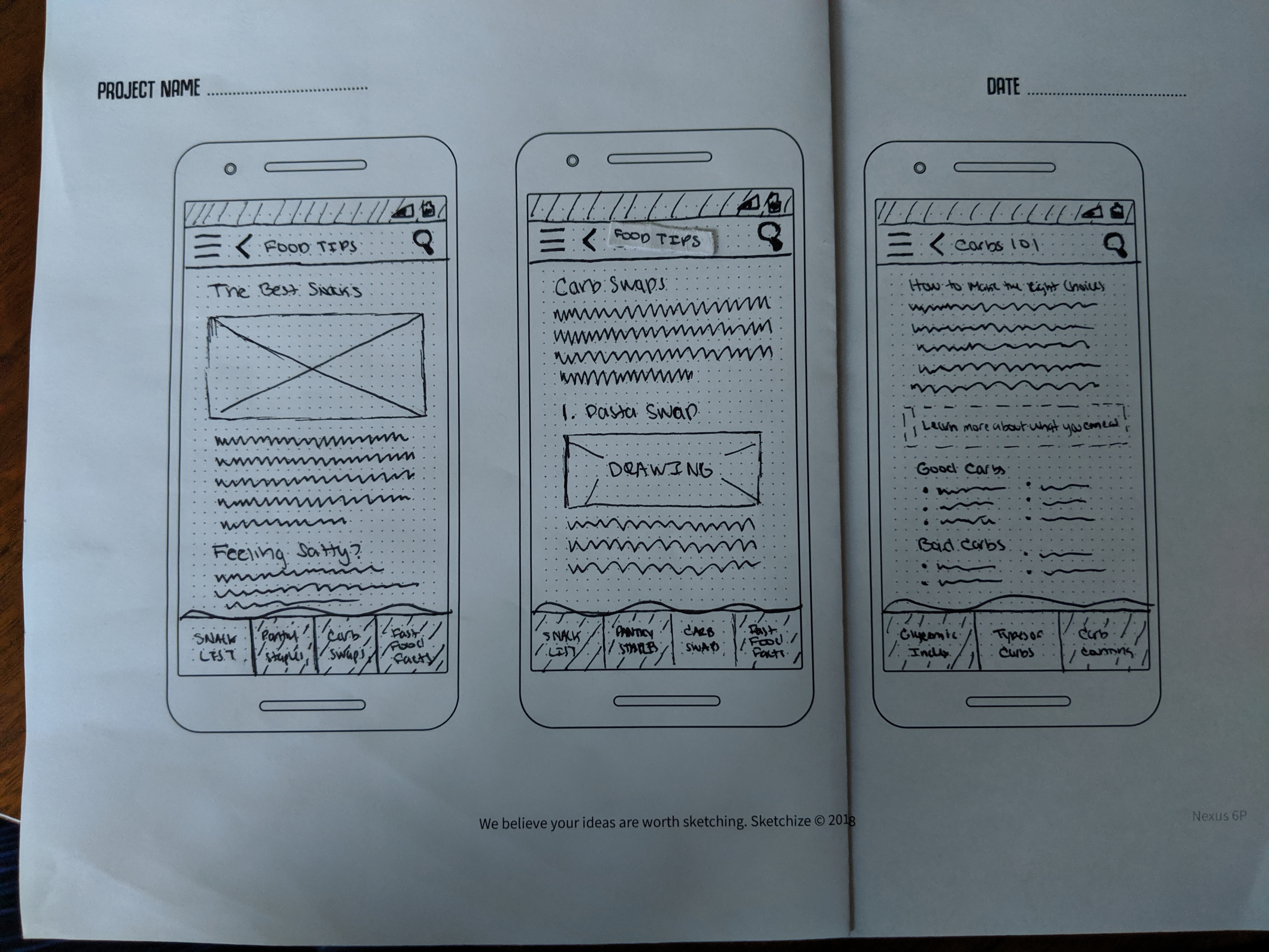
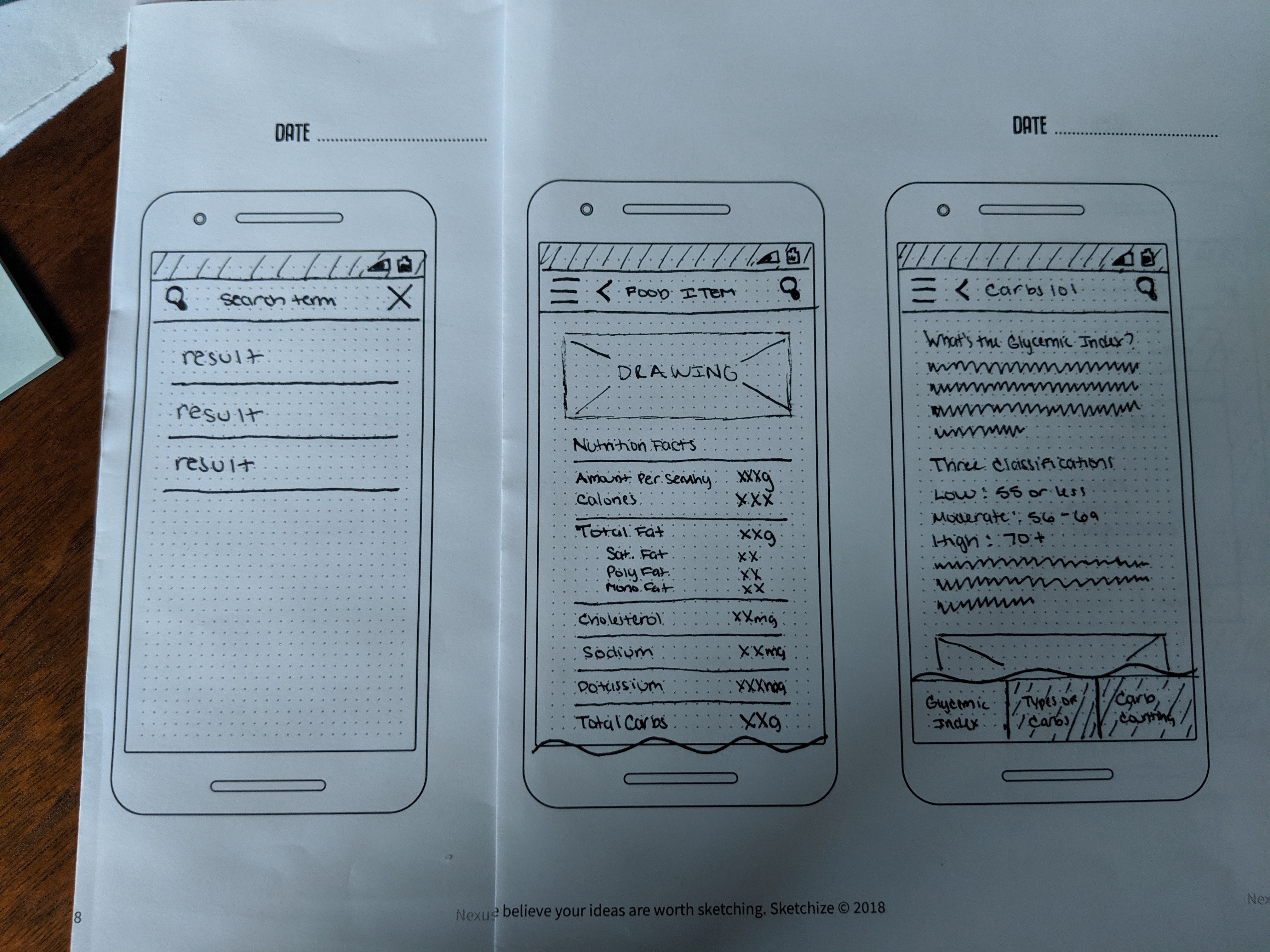
I sketched out 16 screens that I felt best fit the user flows. With my paper sketches in hand I decided to conduct some guerrilla usability testing with the help of my partner and few volunteers from my office. At this point I wanted to assess if my design was headed in the right direction so I gave them a few tasks to complete and discussed with them the overall look/feel.
These were the most important findings:
- Terminology can be tricky
- Terms like 'tips' that I thought would indicate helpful content, were interpreted as too broad or preachy and users tended to avoid the section that used it.
- Look to you're local grocery aisle for inspiration
- Users felt there could be more easily identifiable language within the 'What Can I Eat' section of the app and directed me towards how grocery store aisles are labeled to categorize items.
- People search differently
- I assumed including the search icon prominently within the navigation bar would lead to more interaction, especially with a task about looking up the nutritional data. However, I was wrong and all testers only interacted with it once they were in the 'Nutrition Guide'. Interestingly enough it wasn't because they hadn't noticed it, but due to the fact that they thought the search would be more localized to nutritional data once in that section.
- Tabs are trendy, but not always needed
- I thought tabs would be a simple solution and make the app less cumbersome. However, one tester hated them and the others found the pages that featured them confusing.
Wireframes
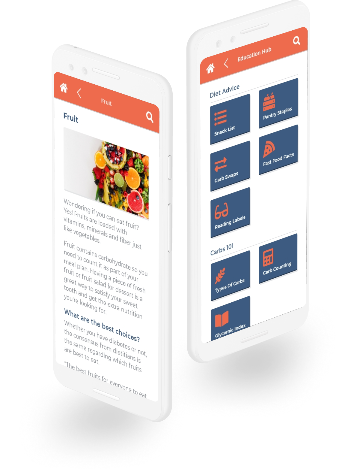
With a round testing under my belt I got to work developing a more formal set of wireframes, incorporating my testers' feedback into the designs. I could have stopped here and done another round of usability testing, but I pushed myself to develop a high-fidelity version as well. This idea had been scratching at my brain for months, and I needed to see a more detailed version of what was floating through my head.
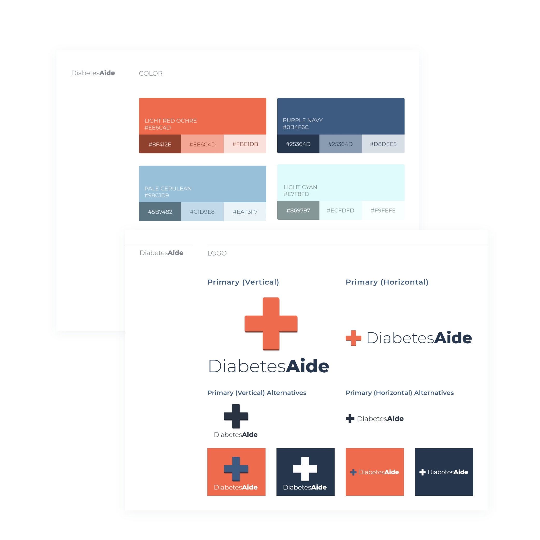
I worked simultaneously developing high fidelity mockups and a style guide. It was important to me that the application was not only easy to use, but easy on the eye and represented a modern medical feel.
Testing the prototype
I created a prototype with Invision so I could conduct a more formal round of usability testing. I developed a script to follow, adapting the scenarios I had used during my guerrilla usability testing while additionally asking about the overall design and future potential of the app.
I wanted to assess the following:
- If the initial changes I had made were enough to get users to the end goals in the task scenarios or if I lacked content.
- Whether the users found the color scheme favorable.
- If users found the layout easy to navigate.
- What users would like to see added to better understand if I was heading in the right direction with the app.
I conducted four usability tests, three in person and one remotely. I was fortunate enough in this round to test with two diabetics, my partner and father, as well as two non-diabetics.
So what did I find out?
- Users always find a way
- I assumed certain key words in the tasks would lead testers to take the same paths as before, but the language changes I made created completely logical avenues for them to find new solutions. I overlooked this fact and realized I didn't have enough examples of end content.
- Language was an still an issue, but at a smaller scale
- One user indicated the term 'Nutrition Guide' made them think they'd find content related to better choices as opposed to data on food. This wasn't something I had considered and I realized they were right as I had observed all the other testers go into the 'Nutrition Guide' when I had tasked them with finding low-carb fruit options.
- Pay attention to your details
- One tester noted that they completely missed the search as its purpose wasn’t apparent to them just from the iconography. This was a failure on my part to recognize that older users may need more labels to further clarify functionality.
It wasn't all bad...
For the most part users responded favorably to the overall layout and color scheme. One user even noted that they felt they could use the app one-handed which made it even more appealing.
All my testers thought the app would be incredibly useful. Specifically, both diabetic testers indicated that focusing on food for the MVP was a good decision and had this been available to them at the time of their diagnosis they would have leaned on it heavily.
Overall, I found that I was headed in the right direction when it came to features for future iterations. Testers indicated desires for meal planning, general info on blood sugar and exercise changes, and an insulin log which were all items I had considered while working on my user stories.
Let's try this again
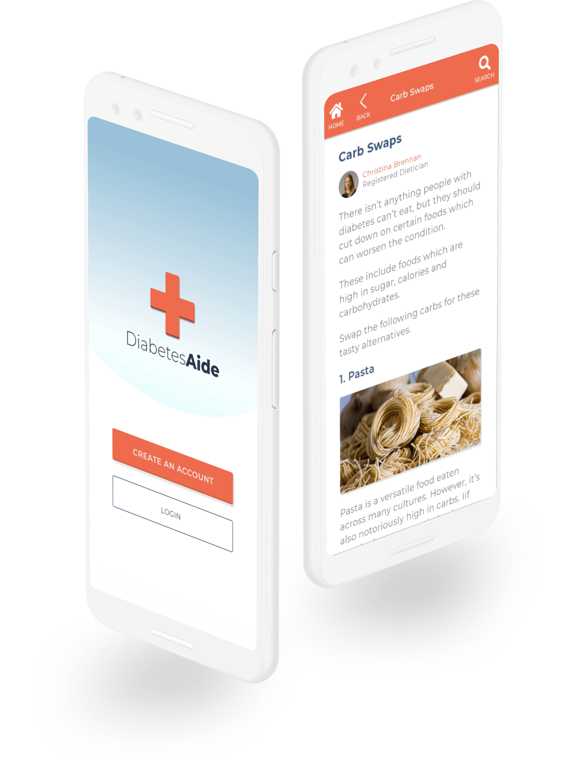
I did end-up doing one more round of edits to my mockups, but lacked the time to do additional usability testing. If the time had been available I think I would have seeked out more diabetics to test with by either reaching back out to my interview subjects or trying to recruit testers within an online diabetic community.
Final Thoughts
As a designer I’ve always been heavily concerned with a user’s journey, and this study gave me the opportunity to explore that fully.
I’ve always done research and tried to construct mental models of the end user, but I’ve never been able to confirm if what I created fulfilled their needs. This may have just been a capstone project for Springboard’s UX Design course, but taking the whole process very seriously benefited me greatly.
Personal Takeaways
- I’ve typically applied the torch and burn method, but iterative design can be just as beneficial and I should probably lean into it more often.
- Data overload can cause me trouble focusing, but once I’m able to identify the base needs in a user’s problems I can find interesting and comprehensive ways to solve them.
- I'm actually pretty good at identifying what users need, but I shouldn't let that go to my head as I am human and can still make bad decisions.
Naturally, I felt most comfortable during the design related aspects, but in the end though what I discovered I loved the most was the overall design thinking process. For me the end product is less important than discovering the right avenue it takes to get there.

