Redefining Gigasheet Establishing Gigasheet's brand identity through a new logo
It's tough for a start-up to establish itself in the market, and it's even harder when their logo doesn't align with their brand identity.
Overview
Role:
Designer
Timeline:
2 months (February – April 2022)
Client:
Gigasheet
Establishing Direction
Gigasheet, an emerging platform with a familiar spreadsheet inteface enables users to explore massive datasets without coding. In early 2022, I was tasked with redesigning Gigasheet's logo as part of shaping the product's overall look and feel to reflect its innovative yet accessible approach to data. The existing logo lacked distinction and presence, and the company felt it was the right time to go in a new direction. We began by evaluating the existing logo:
- What aspects did we like?
- What aspects didn't work?
- Should we preserve any elements or start from scratch?
Through discussions, we discovered that the original logo wasn’t professionally designed. The logomark was chosen simply because it resembled a "G" and "S," and a complementary font was paired with it. Ultimately, no one felt strongly about keeping the old logo.

We continued by examining brands we admired, identifying what made their logos stand out:
- Strong fonts
- Vibrant
- Modern aesthetic
Each logo conveyed a clear personality—distinctive and recognizable—qualities desired also for the new design.
Defining Our Identity
It was determined that the new logo should embody a blend of serious and fun, modern with a hint of retro. It was crucial for the logo to be adaptable: usable in both a long form and a stand-alone logomark. Though there were some remarks that it could be interesting to see if the logo could incorporate a spreadsheet in some way, the only desire was to preserve the presence of the "G" and "S" within the new logomark. As Gigasheet already employed vibrant shades of purple and pink in their website and marketing materials, these colors became the foundation of the logo's palette.
The Design Process
I iterated on the "G" and "S" shapes, generating multiple abstract options.

Alongside the logomarks, I explored complementary font choices, but also explored the font as an avenue to introduce the spreadsheet imagery in a non-traditional way.
With various options at hand, I presented the logos and fonts separately to allow the team to focus on each component. After some discussion we collectively narrowed down the options, moving forward with one logo mark and two fonts.
With the logomark concept chosen, I further refined the design to better align it with either font pairing. Additionally, I played with the shadows and outline to bring some additional movement to the mark. Two options were presentend to the company where we voted and approved the one to move forward with.

End Design
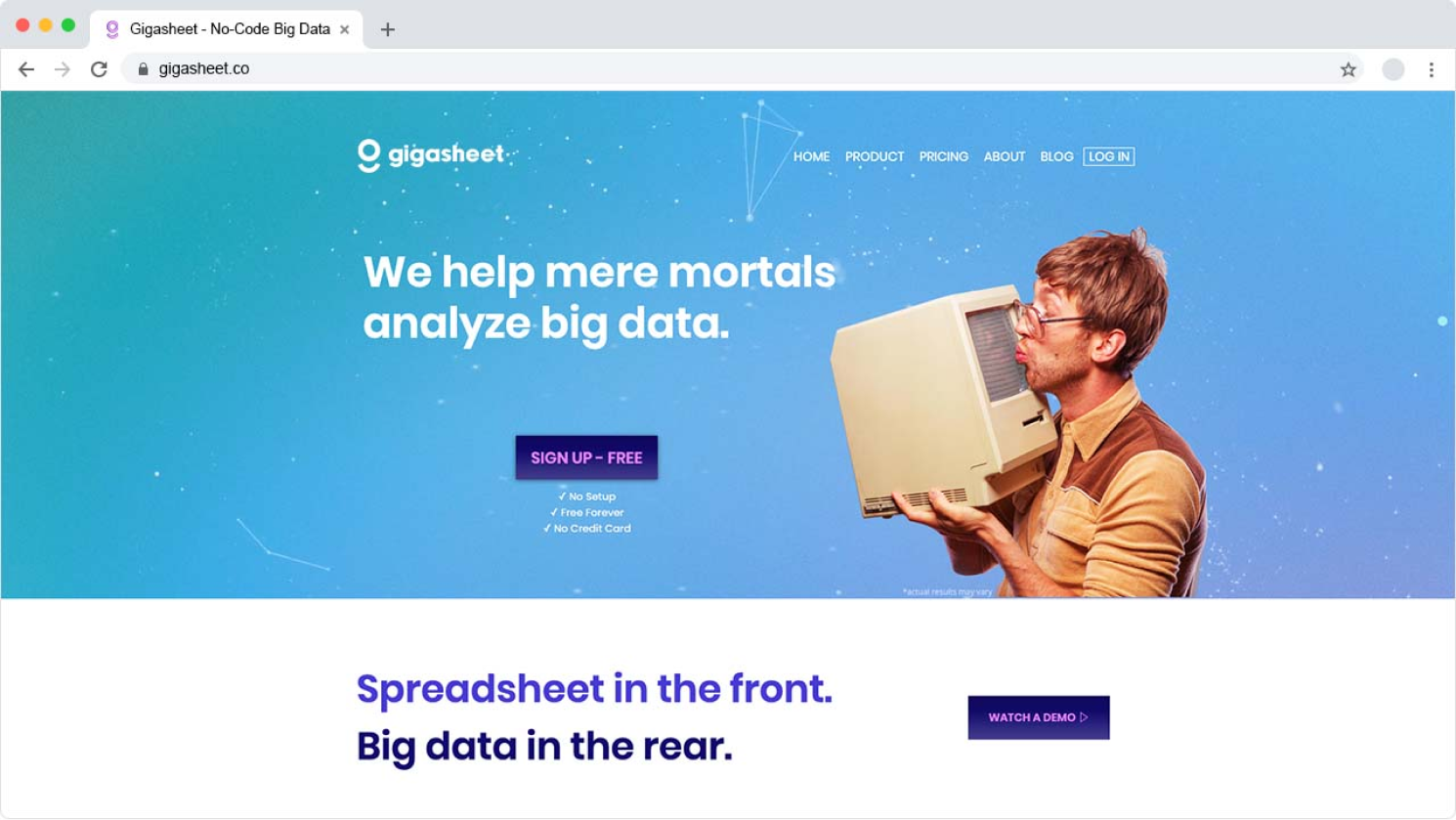
The final design chosen exhibited clean lines, minimal atmosphere, and a modern yet retro aesthetic. The movement in the logomark added a fun and playful attitude, but the grounded and simplicity of the paired font lent a more serious tone which created a balance between the two. This was a design that could evolve with the company in its next steps.
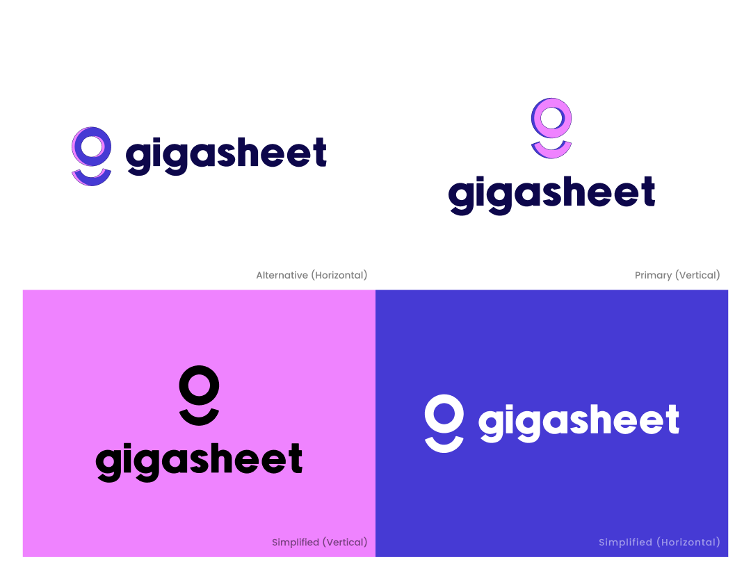
With final approval, I tested the logo's consistency in horizontal and vertical layouts, as well as on various backgrounds—smooth colors and photos alike. Developing horizontal, stacked and abstract mark version with primary, alternative, and simplified variations to ensure flexibility across marketing channels.

